What in the Heckin' Dungeon? Design Diary #3
This is part of a series about how I am designing What In the Heckin’ Dungeon?: a web app for tracking information tabletop role-playing game players need while exploring the world.
I thought back to the last dungeon in my campaign to determine what information needed to be in the app. I knew the players had struggled to keep track of which rooms they had already explored, and the objects in those rooms that they didn’t immediately interact with. Mockup made it pretty easy to start throwing together some interface elements and see what worked.
I based the content on Wave Echo Cave: the final dungeon of the starter D&D campaign Lost Mine of Phandelver. I started with a very simple interface: the name of the dungeon near the top of the screen, the room names in a list on the left side of the screen, and the object names on the right side on buttons.
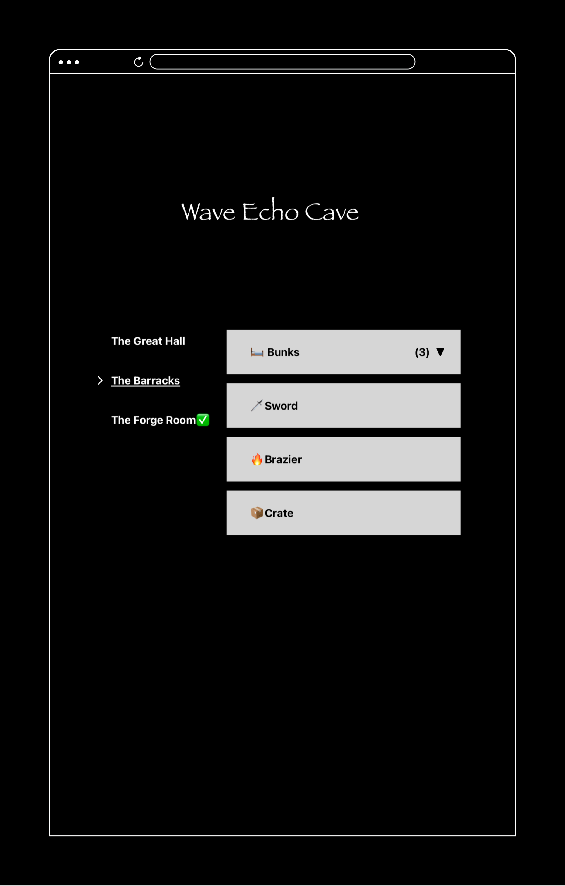
That was the first prototype, so I didn’t spend much time on the graphic design. Enough to make the possible interactions clear, and no less. The current room being underlined as well as indicated with an arrow looked clear enough to me. The arrow on the bunks object pointing down by default was a bad choice that I corrected in the second prototype.
Using emojis in object names came to me very quickly. I put together a document with every emoji I thought I might use in D&D and organized it into categories based on how I expected to use them. Emojis work great because they’re images that are available almost everywhere that can be treated a lot like text.
I needed emojis that were literal visual representations of objects, as well as emojis that were purely signifiers. To help me decide on the best signifiers, I enlisted the help of my good friend Luiz.
- ← Previous
What in the Heckin' Dungeon? Design Diary #2